フランス伝統色の適用例
フランスの伝統的な農家の空気感を再現する
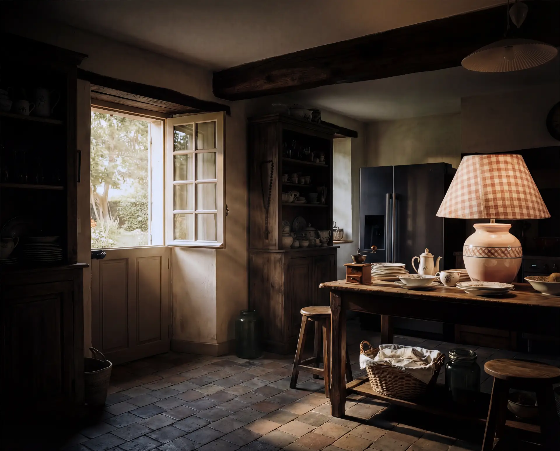
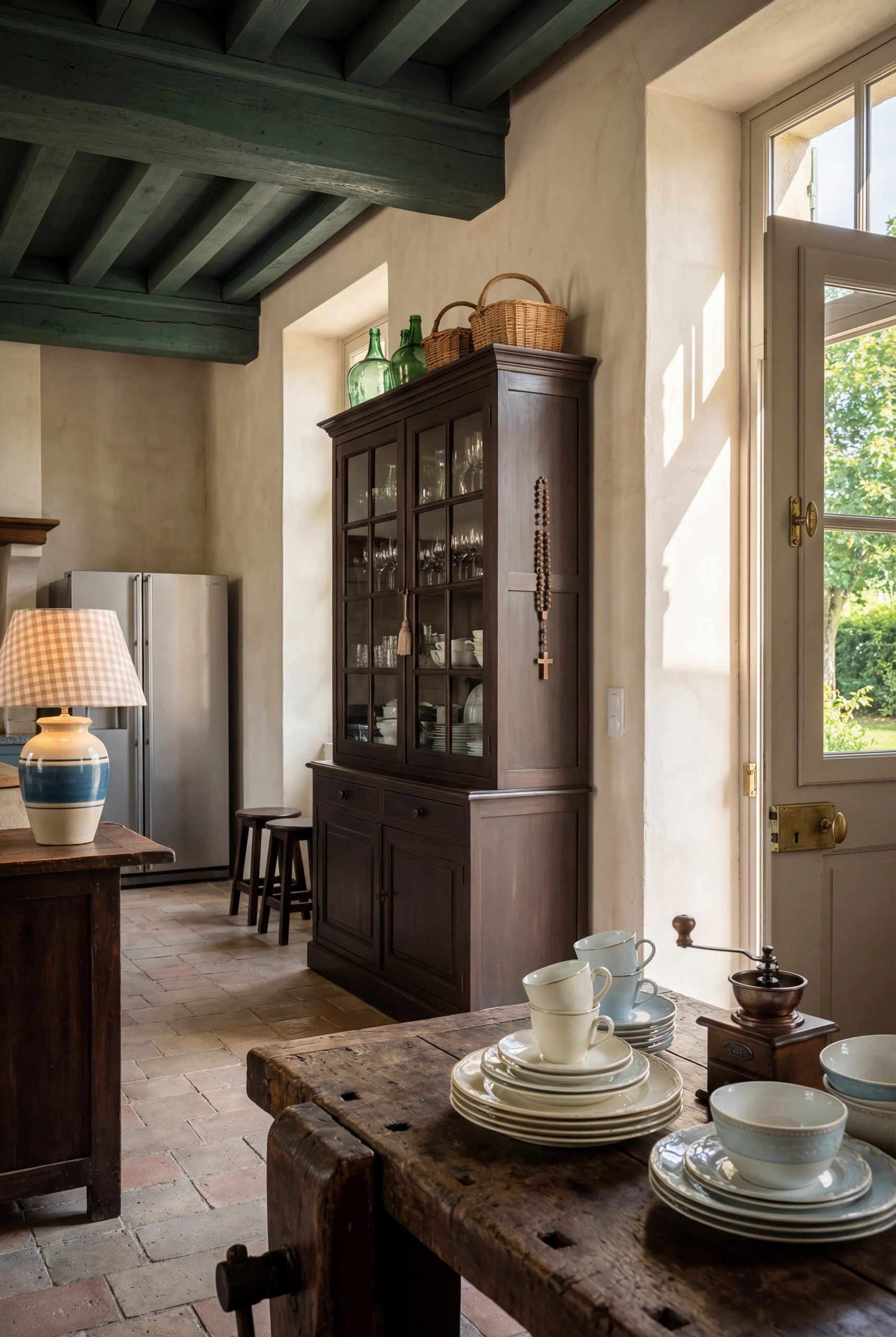
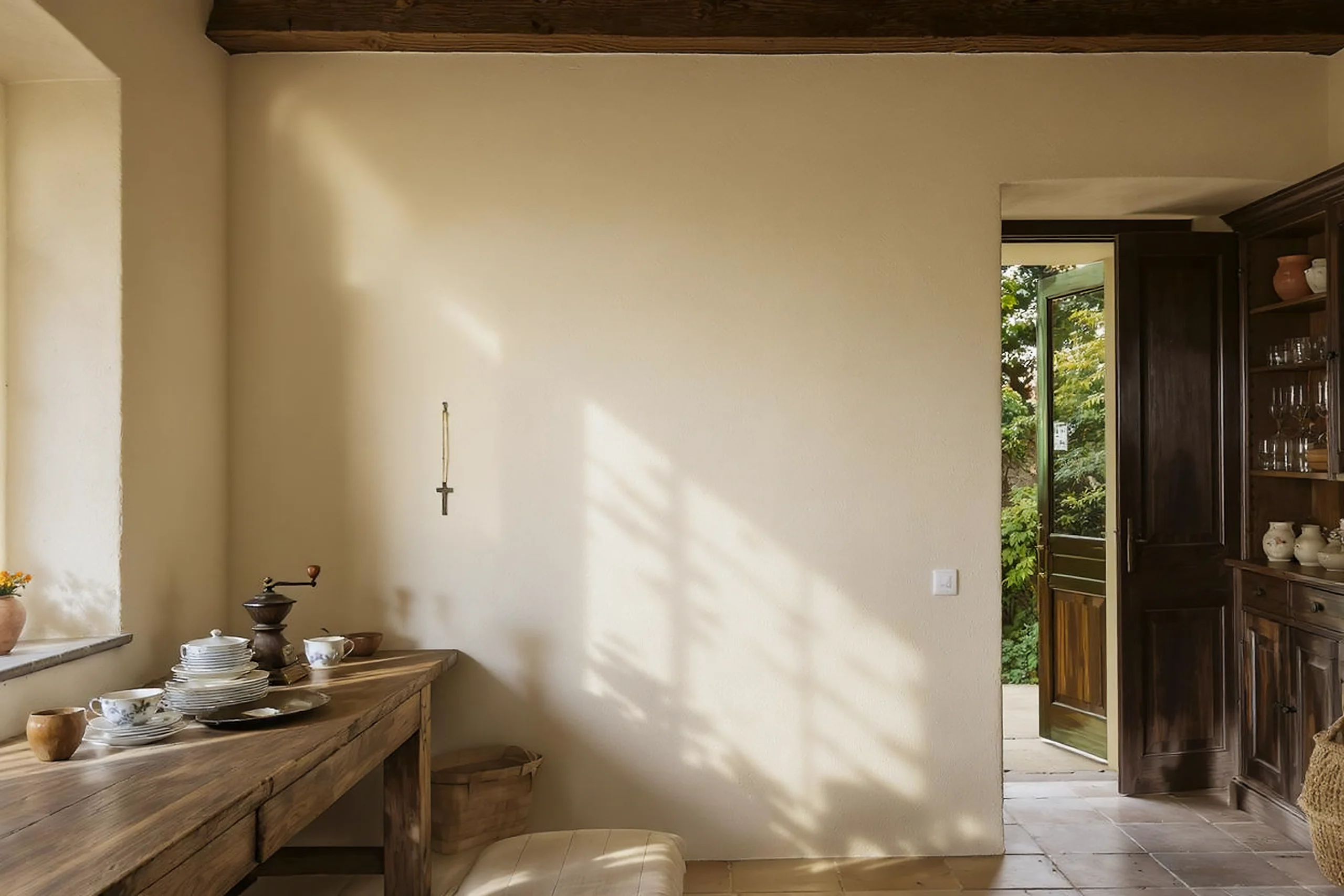
日当たりの良い屋外庭園へと続く開かれた扉、フランスの農家の素朴で魅力的なキッチンの内部を捉えます。
屋内には伝統的なキッチンスペースが広がっています。左側には、濃い色のアンティークの食器棚が置かれ、グラス、マグカップ、ボウルなど様々な食器が収められています。この食器棚の上には、大きな緑色のガラス容器、編みかご、溝付きガラスのシェードが付いた伝統的な照明器具などの装飾品が置かれています。食器棚の側面には十字架付きのロザリオが掛けられています。棚の下には、頑丈で使い込まれた木製のテーブルが中央の作業スペースとして置かれ、リモージュ (Limoges)、セーブル (Sèvres)製の花柄や模様入りの陶器のプレートや蓋付きサーブ皿が整然と積み重ねられています。これらの陶磁器からこの家の格式が伺えます。テーブルの左側には、木と金属で作られたヴィンテージの手動コーヒーグラインダーが見えます。テーブルの下には、イニシャルが刺繍されたBLANC CASSE色の白い布で覆われた籠が収納されている。
木製テーブルの後ろには、素朴な装飾とは対照的なモダンなステンレス製冷蔵庫。テーブル上、食器棚と冷蔵庫の間に置かれた大型のテーブルランプは、カンペール (Quimper)の陶器製ベースに、BEIGE ROSE、CREVETTEと白のチェック柄布製ランプシェードが載っている。
テーブルの右側には、CACHEMIRE(カシュミール)色に塗装されガラス窓のある半開きのドアがあり、外には鮮やかな緑の庭が見え、心地よい自然環境をほのめかしている。開いたドアから差し込む陽光が空間を照らし、GRIS CLAIR(グリー・クレール)色のテラコッタタイルの床に温かな反射を映し出している。ドア枠は明るいCREMEUX(クレムー)色に塗られ、古びた質感のクリーム色の漆喰壁と明るい対比を成している。ドア近くの壁には白い電気スイッチかコンセントがある。テラコッタの床には細工が施された小さなダークウッドのスツールが二つ置かれ、居心地の良い、生活感あふれる農家の住居を思わせる。天井にはむき出しのダークウッドの梁が走り、素朴で古風な雰囲気をさらに強めている。
この画像の雰囲気は温かく、招き入れるような懐かしさを感じさせ、穏やかで静かな気持ちにさせる。アンティークの家具、伝統的な台所用品、そして自然光が組み合わさり、時代を超えた南フランス農家の静かな時間の流れと家庭的な空気感を醸し出している。
フランスの伝統色選択ツールを活用する
掲載のJSONプロンプトではDICフランス伝統色 全322色 選択ツール(欠番F140含む)から12色を指定して画像生成を試みています。
その際、伝統色の文化名+HEXの二重構造とし、Nano Banana Pro が得意な
光 × 素材 × 色反射 を最大限活用します。
Google Nano Banana Pro
JSONプロンプト
{
  « meta »: {
    « generator »: « Google Nano Banana Pro »,
    « title »: « Intérieur d'une cuisine traditionnelle de ferme française (couleurs HEX précises) »,
    « description »: « Visualisation intérieure ultra-haute définition et hyperréaliste d'une cuisine traditionnelle de ferme française, avec un contrôle strict des couleurs HEX basé sur le patrimoine français. »,
    « resolution »: « 8K »,
    « renderStyle » : « photoréaliste, chaleur cinématographique »
  },
  « scene » : {
    « location » : « Cuisine traditionnelle d'une ferme française »,
    « era » : « France rurale intemporelle (influence de la fin du XIXe siècle au début du XXe siècle) »,
    « camera » : {
    « lens » : « grand angle »,
    « perspective » : « à hauteur des yeux »,
    « depthOfField » : « profondeur de champ, netteté du premier plan à l'arrière-plan »
  }
},
  « mood » : {
    « atmosphere » : « calme, accueillant, nostalgique »,
    « emotionalTone » : « élégance rustique, chaleur, authenticité »,
    « cinematicFeel » : « réalisme doré et doux »
  },
  « lighting » : {
    « naturalLight » : {
      « type » : « lumière solaire volumétrique »,
      « direction » : « inclinée à travers une porte entrouverte »,
      « colorTemperature » : 5200,
      « intensity » : « forte mais douce »
    },
    « ambientLight » : {
      « source » : « lampe de table »,
      « colorTemperature » : 2800,
      « intensity » : « faible, chaude »,
      « shadowStyle » : « ombres intérieures douces et diffuses »
    }
  },
  « paletteDeCouleurs » : {
    « priorité » : « couleurs traditionnelles françaises basées sur le système HEX »,
    « murs » : {
      « hex » : « #F3EFE6 »,
      « nomTraditionnel » : « CRÈME ANCIEN »,
      « description » : « crépi crème vieilli avec grain tactile »
    },
    « floor » : {
      « hex » : « #B5B5B0 »,
      « traditionalName » : « GRIS CLAIR »,
      « material » : « carreaux de terre cuite patinés »
    },
    « porte » : {
      « principale » : {
        « hex » : « #C6C1B6 »,
        « nom traditionnel » : « CACHEMIRE »,
        « description » : « vert-beige historique doux et discret »
      },
      « frame »: {
        « hex »: « #EFE6D8 »,
        « traditionalName »: « CREMEUX »,
        « description »: « blanc cassé crémeux et chaleureux »
      }
    },
    « textiles » : {
      « lin » : {
        « hex » : « #F7F5F0 »,
        « traditionalName » : « BLANC CASSE »,
        « usage » : « tissu brodé drapé sur un panier »
      },
      « lampshade » : {
        « checkeredColors » : [
          {
            « hex » : « #D6B6B1 »,
            « traditionalName » : « BEIGE ROSE »
          },
          {
            « hex »: « #E3A39C »,
            « traditionalName »: « CREVETTE »
          },
          {
            « hex »: « #FFFFFF »,
            « traditionalName »: « BLANC PUR »
          }
        ]
      }
    },
    « accentColors » : {
      « wood » : « #4A3A2A »,
      « metalPatina » : « #6E5B4B »,
      « gardenGreen » : « #4F7F4A »
    }
  },
  « materialsAndTextures » : {
    « plaster » : « texture rugueuse, appliquée à la main, avec des traces visibles du temps »,
    « wood » : « poutres sombres, taillées à la main, avec une patine profonde »,
    « floor » : « terre cuite mate, bords usés et fissures subtiles »,
    « ceramic » : « porcelaine émaillée avec de fins détails floraux »,
    « metal » : « contraste entre l'acier bruni et l'inox brossé »
  },
  « furnitureAndObjects » : {
    « centerpiece » : {
      « object » : « table de travail en bois de ferme »,
      « colorHex » : « #5A4632 »,
      « condition » : « très usée, polie par le temps »
    },
    « tabletopItems » : [
      {
        « object » : « porcelaine de Limoges et de Sèvres »,
        « primaryColorHex » : « #F8F8F6 »,
        « patternDetail » : « motifs floraux délicats »
      },
      {
        « objet » : « moulin à café manuel »,
        « woodHex » : « #3B2E23 »,
        « metalHex » : « #7A6A58 »
      }
    ],
    « storage » : {
      « cupboard » : {
        « woodHex » : « #3E2F24 »,
        « contents » : [
          « verrerie transparente »,
          « tasses en céramique »,
          « bols »
        ],
        « topItems » : [
          {
            « object » : « bocal en verre vert »,
            « hex » : « #3F6B57 »
          },
          {
            « object » : « panier tressé »,
            « hex » : « #B89D6A »
          },
          {
            « object » : « luminaire en verre nervuré »,
            « hex » : « #E6E6E2 »
          }
        ],
        « detail » : {
          « object » : « chapelet en bois avec croix »,
          « woodHex » : « #5C4A3A »
        }
      }
    },
    « additionalElements » : [
      {
        « object » : « lampe de table »,
        « base » : {
          « type » : « poterie de Quimper »,
          « primaryHex » : « #2F6F8F »,
          « accentHex » : « #F2E6D8 »
        }
      },
      {
        « object » : « tabourets »,
        « count » : 2,
        « woodHex » : « #3A2C22 »
      },
      {
        « objet » : « réfrigérateur »,
        « matériau » : « acier inoxydable »,
        « hex » : « #C9CACC »
      },
      {
        « objet » : « interrupteur électrique »,
        « hex » : « #FFFFFF »
      }
    ]
  },
  « environment » : {
    « exteriorView » : {
      « visibleGarden » : true,
      « foliageHex » : « #4F7F4A »,
      « lightEffect » : « végétation ensoleillée projetant une lumière réfléchie dans la pièce »
    }
  },
  « rendering » : {
    « detailLevel » : « ultra-high »,
    « textureAccuracy » : « photorealistic »,
    « colorAccuracy » : « strict HEX adherence »,
    « postProcessing » : « cinematic warmth, subtle contrast curve »
  },
    « output » : {
    « format » : « image »,
    « aspectRatio » : « large »,
    « useCase » : « visualisation d'intérieur patrimonial,
images de style de vie rustique luxueux »
  }
}
日本語訳
{
「meta」: {
「generator」: 「Google Nano Banana Pro」,
「title」: 「伝統的なフランス農家のキッチンインテリア(HEXカラー正確)」,
「description」: 「伝統的なフランス農家のキッチンを超高精細で超リアルに可視化。厳格なHEXベースのフランス伝統色調管理を実施。」,
「resolution」: 「8K」,
「renderStyle」: 「フォトリアリスティック、シネマティックな温かみ」
},
「scene」: {
「location」: 「伝統的なフランス農家のキッチン」,
「era」: 「時代を超えたフランスの田舎(19世紀末~20世紀初頭の影響)」,
「camera」: {
「lens」: 「広角」,
「perspective」: 「目線レベル」,
「depthOfField」: 「深い焦点、前景から背景までシャープ」
}
},

「ムード」: {
「雰囲気」: 「穏やかで居心地良く、ノスタルジック」,
「情緒的トーン」: 「素朴な優雅さ、温かみ、本物らしさ」,
「映画的質感」: 「柔らかな黄金色のリアリズム」
},
「照明」: {
「naturalLight」: {
「type」: 「ボリューム型太陽光」,
「direction」: 「半開きのドアから斜めに差し込む」,
「colorTemperature」: 5200,
「intensity」: 「強いが柔らかなエッジ」
},
「ambientLight」: {
「source」: 「テーブルランプ」,
「colorTemperature」: 2800,
「intensity」: 「低照度で暖色」,
「shadowStyle」: 「柔らかく拡散した室内影」
}
},

「colorPalette」: {
「priority」: 「HEXベースのフランス伝統色」,
「walls」: {
「hex」: 「#F3EFE6」,
「traditionalName」: 「古びたクリーム」,
「description」: 「経年変化したクリーム色の漆喰、触感ある木目調」
},
「floor」: {
「hex」: 「#B5B5B0」,
「traditionalName」: 「GRIS CLAIR」,
「material」: 「風化したテラコッタタイル」
},
「ドア」: {
「メイン」: {
「hex」: 「#C6C1B6」,
「伝統的名称」: 「カシミア」,
「説明」: 「柔らかく落ち着いた歴史的な緑がかったベージュ」
},
「frame」: {
「hex」: 「#EFE6D8」,
「traditionalName」: 「CREMEUX」,
「description」: 「温かみのあるクリーミーなオフホワイト」
}
},
「textiles」: {
「linen」: {
「hex」: 「#F7F5F0」,
「traditionalName」: 「BLANC CASSE」,
「usage」: 「刺繍入り布(かごにかけられたもの)」
},
「ランプシェード」: {
「チェック柄の色」: [
{
「hex」: 「#D6B6B1」,
「伝統的な名称」: 「ベージュローズ」
},
{
「hex」: 「#E3A39C」,
「traditionalName」: 「CREVETTE」
},
{
「hex」: 「#FFFFFF」,
「traditionalName」: 「BLANC PUR」
}
]
}
},
「アクセントカラー」: {
「木」: 「#4A3A2A」,
「金属の緑青」: 「#6E5B4B」,
「ガーデングリーン」: 「#4F7F4A」
}
},
「materialsAndTextures」: {
「plaster」: 「粗く、手作業で塗られた質感で経年変化が確認できる」,
「wood」: 「暗色で、手斧で削られた梁に深い緑青」,
「floor」: 「マットなテラコッタ、縁は磨耗し微細なひび割れ」,
「ceramic」: 「釉薬を施した磁器に繊細な花模様」,
「metal」: 「磨かれた鋼とブラッシュドステンレスのコントラスト」
},
「furnitureAndObjects」: {
「centerpiece」: {
「object」: 「木製ファームハウス作業台」,
「colorHex」: 「#5A4632」,
「condition」: 「酷使され、時を経て磨かれた」
},
「tabletopItems」: [
{
「object」: 「リモージュとセーヴルの磁器」,
「primaryColorHex」: 「#F8F8F6」,
「patternDetail」: 「繊細な花模様」
},
{
「object」: 「手動コーヒーミル」,
「woodHex」: 「#3B2E23」,
「metalHex」: 「#7A6A58」
}
],
「storage」: {
「cupboard」: {
「woodHex」: 「#3E2F24」,
「contents」: [
「透明なガラス製品」,
「陶器のマグカップ」,
「ボウル」
],
「topItems」: [
{
「object」: 「緑色のガラス瓶」,
「hex」: 「#3F6B57」
},
{
「object」: 「編みかご」,
「hex」: 「#B89D6A」
},
{
「object」: 「リブ加工ガラス照明器具」,
「hex」: 「#E6E6E2」
}
],
「detail」: {
「object」: 「木製ロザリオ(十字架付き)」,
「woodHex」: 「#5C4A3A」
}
}
},
「additionalElements」: [
{
「object」: 「テーブルランプ」,
「base」: {
「type」: 「カンペール陶器」,
「primaryHex」: 「#2F6F8F」,
「accentHex」: 「#F2E6D8」
}
},
{
「object」: 「スツール」,
「count」: 2,
「woodHex」: 「#3A2C22」
},
{
「object」: 「refrigerator」,
「material」: 「stainless steel」,
「hex」: 「#C9CACC」
},
{
「object」: 「electrical switch」,
「hex」: 「#FFFFFF」
}
]
},
「environment」: {
「exteriorView」: {
「visibleGarden」: true,
「foliageHex」: 「#4F7F4A」,
「lightEffect」: 「日差しを受けた緑が室内に反射光を投げかける」
}
},
  「レンダリング」: {
    「詳細レベル」: 「超高」,
    「テクスチャ精度」: 「フォトリアリスティック」,
    「色精度」: 「厳密なHEX準拠」,
    「後処理」: 「シネマティックな温かみ、微妙なコントラストカーブ」
  },
  「output」: {
    「format」: 「image」,
    「aspectRatio」: 「wide」,
    「useCase」: 「伝統的インテリアの可視化、高級感ある素朴なライフスタイルイメージ」
  }
}
汎用性のある自然言語+HEX色指定プロンプト
SHORT OPTIMIZED PROMPT (EN, ≤2000 chars)
上記のJSONコードと比べるとかなりシンプルな記述になっています。
FLUX-AI.IOなどのプラットフォームからNano Banana Proなどで出力するにはプロンプトを入力する**コンテキストボックスに文字数最大2,000文字という制限があります。この場合、文字数の多いJSONコードは入力できません。この場合どうしても自然言語に頼らざるを得ないわけです。
自然言語入力ではプロンプトの文字数を最小限の指示に抑える必要性から、伝統色の指定は緩く、画像もシンプルな表現にとどまっています。
**コンテキストボックスとは:
AI画像生成における「コンテキストボックス」という言葉は、主にAIが生成や編集の際に参照する「文脈(背景情報)」を指定・入力するための領域を指します。
AIが一度に処理できる情報の限界量(記憶容量のようなもの)とも解釈できます。
A hyper-realistic, ultra-high-definition (8K) wide-angle interior photograph of a traditional French farmhouse kitchen, rendered with strict HEX-based French heritage color accuracy.
Timeless rural France atmosphere, calm, warm, nostalgic, refined rustic elegance.

Aged plaster walls in CREME ANCIEN (#F3EFE6) with visible grain and tactile imperfections. Ceiling features heavy, dark hand-hewn wooden beams in deep patinated brown (#4A3A2A). The floor is laid with weathered terracotta tiles in GRIS CLAIR (#B5B5B0), matte and uneven.

Golden volumetric sunlight (5200K) streams through a half-open wooden door painted CACHEMIRE (#C6C1B6) with a CREMEUX (#EFE6D8) frame, revealing a vivid sunlit garden in natural green (#4F7F4A). Light rays illuminate dust particles and cast soft-edged shadows across the room.

At the center stands a sturdy farmhouse worktable in dark aged wood (#5A4632), heavily worn and polished by time. On the table: stacked Limoges and Sèvres porcelain plates and lidded dishes in soft off-white (#F8F8F6) with delicate floral motifs, beside a vintage manual coffee grinder made of dark wood (#3B2E23) and burnished metal (#7A6A58).

A tall dark wooden cupboard (#3E2F24) holds assorted glassware, ceramic mugs, and bowls. On top: a green glass jar (#3F6B57), a rustic woven basket (#B89D6A), and a ribbed glass light fixture (#E6E6E2). A traditional wooden rosary with cross hangs on the cupboard side (#5C4A3A).

Beneath the table rests a basket draped with embroidered linen in BLANC CASSE (#F7F5F0). A table lamp with a hand-painted Quimper pottery base (blue #2F6F8F, cream #F2E6D8) emits warm ambient light (2800K) through a checkered lampshade in BEIGE ROSE (#D6B6B1), CREVETTE (#E3A39C), and white (#FFFFFF).

In the background, a modern stainless steel refrigerator (#C9CACC) subtly contrasts with the rustic setting. Two small dark wooden stools (#3A2C22) rest against the wall. A simple white electrical switch (#FFFFFF) is visible near the door.

Photorealistic textures: rough plaster, glazed ceramics, polished steel, aged wood. Cinematic warmth, deep focus, no stylization, no fantasy, no modern decor beyond specified appliance.
シンプルプロンプトからさらなる一歩
雑誌写真を生成
さてここからはAI画像生成の真骨頂、シンプルプロンプトで指定したフランスの伝統色の関係性(HEX指定が効く)をベースに、現代の生活感あるマガジンフォトにチャレンジです。
この構図特化版のポイント
雑誌写真の鉄則
完全左右対称を避ける
手前を切る(cropping)ことで“生活感”を出す
主光源=ストーリーの中心(今回はドア)
Nano Banana Pro が特に得意な要素
レイヤー構造(foreground / mid / background)
素材の反射と間接光
構図・視線誘導・誌面品質重視 の 完成プロンプトです。
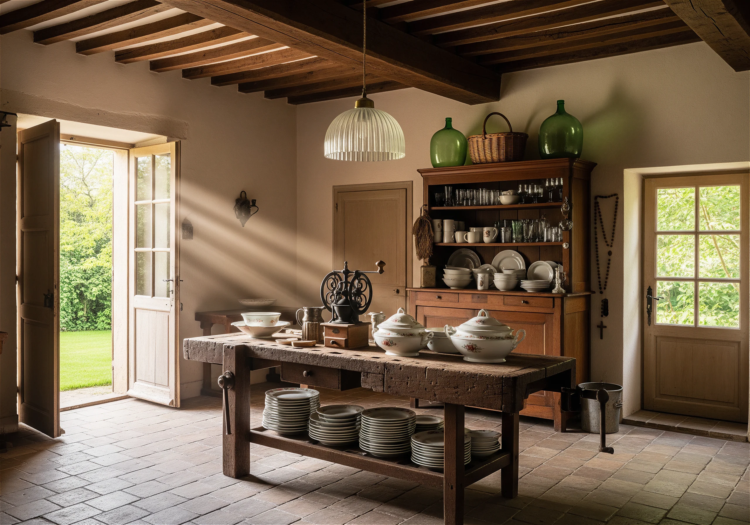
A hyper-realistic, ultra-high-definition (8K) vertical-format interior photograph, composed specifically for a luxury interior magazine double-page spread. Professional architectural photography style, refined, timeless, editorially restrained.

Camera oriented in portrait orientation, positioned at eye level (~150cm), slightly offset from center to avoid symmetry. Wide-angle lens with controlled distortion, preserving natural proportions. Strong vertical emphasis, allowing ceiling beams, door height, and wall textures to breathe within the frame.

Foreground (lower third): the edge of a dark, time-worn farmhouse worktable (#5A4632) partially cropped at the bottom, creating intimacy and scale. Surface rendered with sharp micro-detail: wood grain, scratches, patina. Styled asymmetrically with stacked Limoges and Sèvres porcelain (#F8F8F6) and a vintage manual coffee grinder (wood #3B2E23, metal #7A6A58), arranged to leave intentional negative space for editorial layout.

Midground (center vertical axis): a tall dark wooden cupboard (#3E2F24) rising through the frame, emphasizing height. Glassware and ceramics subtly catching light. On top, a green glass jar (#3F6B57) and woven basket (#B89D6A) add vertical rhythm. A wooden rosary with cross (#5C4A3A) hangs naturally, adding cultural narrative without visual dominance.

Background (upper third): a half-open door painted CACHEMIRE (#C6C1B6) with a CREMEUX (#EFE6D8) frame acts as the primary visual anchor. Golden volumetric sunlight (5200K) enters diagonally from above, creating a vertical light column. Beyond the door, a sunlit garden in natural green (#4F7F4A) provides contrast and depth.

Walls finished in aged plaster CREME ANCIEN (#F3EFE6), side-lit to emphasize texture. Floor of weathered terracotta tiles GRIS CLAIR (#B5B5B0) subtly leads perspective upward. Heavy ceiling beams in deep patinated wood (#4A3A2A) frame the top of the image, reinforcing vertical scale.

Secondary lighting: a table lamp with Quimper pottery base (blue #2F6F8F, cream #F2E6D8) and checkered shade in BEIGE ROSE (#D6B6B1), CREVETTE (#E3A39C), and white (#FFFFFF), adding warm ambient glow (2800K).

A modern stainless steel refrigerator (#C9CACC) is placed deep in the background, visually minimized, providing subtle contemporary contrast. Two small dark wooden stools (#3A2C22) rest quietly along the wall.

Editorial finish: natural color grading, strict HEX color fidelity, deep focus, soft vignette, calm tonal transitions. No clutter, no fantasy, no stylization. Designed to allow text overlay and gutter space across a magazine spread.
伝統的なフランス農家の台所を捉えた、ハイパーリアリスティックな超高精細(8K)広角室内写真。プロの建築写真家が撮影した高級インテリア雑誌の特集用ショットとして構成。
カメラは人間の目線の高さ(約150cm)に設置、中心からややオフセット。自然なプロポーションを保つ広角レンズを使用(歪みなし)。前景・中景・背景の階層化による強い奥行き感。明快な導線(リーディングライン)が視線を陽光が差し込む扉へと誘導。
前景:経年変化した濃い木目(#5A4632)の古びた農家の作業台。親密感とリアリズムを強調するため下端を部分的に切り取り。天板は鮮明に焦点が合い、細かい木目、傷、経年変化の風合いが表現されている。テーブル上には、繊細な花模様が施されたリモージュとセーヴルの磁器(#F8F8F6)を編集的なバランスを考慮して非対称に積み重ね、ヴィンテージの手動コーヒーミル(ダークウッド #3B2E23 と磨かれた金属 #7A6A58)を配置。
中景:対称を避けるため軸からやや外れた位置に配置された背の高いダークウッドの食器棚(#3E2F24)。開いた棚にはガラス器や陶器が並び、微かな反射を映す。上段には緑のガラス瓶(#3F6B57)と編みかご(#B89D6A)が縦のリズムを生み出す。木製のロザリオ(#5C4A3A)が自然に吊るされ、文化的背景を物語るディテールを加える。
背景:カシミール色(#C6C1B6)に塗られた半開きの扉とクレーム色(#EFE6D8)の枠が主要な光源と視覚的アンカーとなる。体積感のある太陽光(5200K)が斜めに入り込み、塵の粒子を照らし出し、質感に柔らかなハイライトを生む。扉の向こうには、自然の緑(#4F7F4A)に照らされた庭が広がり、色彩のコントラストと奥行きを提供する。
壁面は古びた漆喰(クレーム・アンシアン #F3EFE6)で仕上げられ、サイドライトで質感を引き立てるように撮影されている。風化したテラコッタタイル(GRIS CLAIR #B5B5B0)の床がドアへ向かう遠近線を導く。深い緑青を帯びた木材(#4A3A2A)の天井梁が上部構図を縁取る。
照明は自然光と温かみのある間接照明(2800K)を洗練されたバランスで融合。キンペール陶器ベース(青 #2F6F8F、クリーム #F2E6D8)のテーブルランプと、ベージュローズ(#D6B6B1)、クレベット(#E3A39C)、白(#FFFFFF)のチェック柄ランプシェードが柔らかな編集的な光を添える。
モダンなステンレス製冷蔵庫(#C9CACC)は背景奥に控えめに配置され、フレームを支配することなく現代的なコントラストを添える。壁際に静かに寄りかかる2つのダークウッド製スツール(#3A2C22)。
雑誌スタイルの抑制で撮影:雑然さなし、誇張なし、幻想なし。自然なカラーグレーディング、厳密なHEXカラー忠実度、現実的なコントラストカーブ、微妙なヴィネット処理。高級インテリアやライフスタイル誌にふさわしい、静謐で優雅、時代を超えたフランスの田園風景を醸し出しています。縦構図(雑誌見開き用)
{
  « meta »: {
    « generator »: « Google Nano Banana Pro »,
    « title »: « Intérieur traditionnel d'une cuisine de ferme française (couleurs HEX précises) »,
    « description »: « Visualisation intérieure ultra-haute définition et hyperréaliste d'une cuisine traditionnelle de ferme française, avec un contrôle strict des couleurs HEX basé sur le patrimoine français. »,
    « resolution »: « 8K »,
    « renderStyle »: « photorealistic, cinematic warmth »
  },
  « scene »: {
    « location »: « Traditional French farmhouse kitchen »,
    « era »: « Timeless rural France (late 19th–early 20th century influence) »,
    « camera » : {
      « lens » : « grand angle »,
      « perspective » : « à hauteur des yeux »,
      « depthOfField » : « profondeur de champ, netteté du premier plan à l'arrière-plan »
    }
  },
  « ambiance » : {
    « atmosphère » : « calme, accueillante, nostalgique »,
    « ton émotionnel » : « élégance rustique, chaleur, authenticité »,
    « sensation cinématographique » : « réalisme doré et doux »
  },
  « lighting » : {
    « naturalLight » : {
      « type » : « lumière solaire volumétrique »,
      « direction » : « inclinée à travers une porte entrouverte »,
      « colorTemperature » : 5200,
      « intensity » : « forte mais douce »
    },
    « ambientLight » : {
      « source » : « lampe de table »,
      « colorTemperature » : 2800,
      « intensity » : « faible, chaude »,
      « shadowStyle » : « ombres intérieures douces et diffuses »
    }
  },
  « paletteDeCouleurs » : {
    « priorité » : « couleurs traditionnelles françaises basées sur le système HEX »,
    « murs » : {
      « hex » : « #F3EFE6 »,
      « nomTraditionnel » : « CRÈME ANCIEN »,
      « description » : « crépi crème vieilli avec grain tactile »
    },
    « sol » : {
      « hex » : « #B5B5B0 »,
      « nom traditionnel » : « GRIS CLAIR »,
      « matériau » : « carreaux de terre cuite patinés »
    },
    « porte » : {
      « principale » : {
        « hex » : « #C6C1B6 »,
        « nom traditionnel » : « CACHEMIRE »,
        « description » : « vert-beige historique doux et discret »
      },
      « frame »: {
        « hex »: « #EFE6D8 »,
        « traditionalName »: « CREMEUX »,
        « description »: « blanc cassé crémeux et chaleureux »
      }
    },
    « textiles » : {
      « lin » : {
        « hex » : « #F7F5F0 »,
        « traditionalName » : « BLANC CASSE »,
        « usage » : « tissu brodé drapé sur un panier »
      },
      « lampshade » : {
        « checkeredColors » : [
          {
            « hex » : « #D6B6B1 »,
            « traditionalName » : « BEIGE ROSE »
          },
          {
            « hex »: « #E3A39C »,
            « traditionalName »: « CREVETTE »
          },
          {
            « hex »: « #FFFFFF »,
            « traditionalName »: « BLANC PUR »
          }
        ]
      }
    },
    « accentColors » : {
      « wood » : « #4A3A2A »,
      « metalPatina » : « #6E5B4B »,
      « gardenGreen » : « #4F7F4A »
    }
  },
  « matériauxEtTextures » : {
    « plâtre » : « texture rugueuse, appliquée à la main, avec des traces visibles du temps »,
    « bois » : « poutres sombres, taillées à la main, avec une patine profonde »,
    « sol » : « terre cuite mate, bords usés et fissures subtiles »,
    « céramique » : « porcelaine émaillée avec de fins détails floraux »,
    « métal » : « contraste entre l'acier bruni et l'inox brossé »
  },
  « furnitureAndObjects » : {
    « centerpiece » : {
      « object » : « table de travail en bois de ferme »,
      « colorHex » : « #5A4632 »,
      « état » : « très usé, poli par le temps »
    },
    « objets de table » : [
      {
        « objet » : « porcelaine de Limoges et de Sèvres »,
        « couleur primaire hexadécimale » : « #F8F8F6 »,
        « détail du motif » : « motifs floraux délicats »
      },
      {
        « object » : « moulin à café manuel »,
        « woodHex » : « #3B2E23 »,
        « metalHex » : « #7A6A58 »
      }
    ],
    « storage » : {
      « cupboard » : {
        « woodHex » : « #3E2F24 »,
        « contents » : [
          « verrerie transparente »,
          « tasses en céramique »,
          « bols »
        ],
        « topItems » : [
          {
            « object » : « bocal en verre vert »,
            « hex » : « #3F6B57 »
          },
          {
            « objet » : « panier tressé »,
            « hex » : « #B89D6A »
          },
          {
            « object » : « luminaire en verre nervuré »,
            « hex » : « #E6E6E2 »
          }
        ],
        « detail » : {
          « object » : « chapelet en bois avec croix »,
          « woodHex » : « #5C4A3A »
        }
      }
    },
    « additionalElements » : [
      {
        « object » : « lampe de table »,
        « base » : {
          « type » : « poterie de Quimper »,
          « primaryHex » : « #2F6F8F »,
          « accentHex » : « #F2E6D8 »
        }
      },
      {
        « object » : « tabourets »,
        « count » : 2,
        « woodHex » : « #3A2C22 »
      },
      {
        « objet » : « réfrigérateur »,
        « matériau » : « acier inoxydable »,
        « hex » : « #C9CACC »
      },
      {
        « objet » : « interrupteur électrique »,
        « hex » : « #FFFFFF »
      }
    ]
  },
  « environment » : {
    « exteriorView » : {
      « visibleGarden » : true,
      « foliageHex » : « #4F7F4A »,
      « lightEffect » : « végétation ensoleillée projetant une lumière réfléchie dans la pièce »
    }
  },
  « rendering » : {
    « detailLevel » : « ultra-high »,
    « textureAccuracy » : « photoréaliste »,
    « colorAccuracy » : « respect strict du code
🧠 “編集者が好む余白”強化版
✍️ 編集者が「使いやすい」と感じる理由
- 壁の余白=即テキスト置き場
- 主役を“中央に置かない”ことで見出しと競合しない
- 光がグラデーション → 白文字・黒文字どちらも可
- 生活感は残しつつ「情報量を抑制」
実務的な観点から強調すべき条件:
ニュートラルなコントラストカーブ、厳密なHEXカラー忠実度、臨床的なシャープネスを排した深い焦点。テキスト余白を尊重した微妙なヴィネット処理。雑然さ・誇張・装飾的過剰を排除。落ち着きと広々感、タイポグラフィに優しい空間を意図したデザイン。
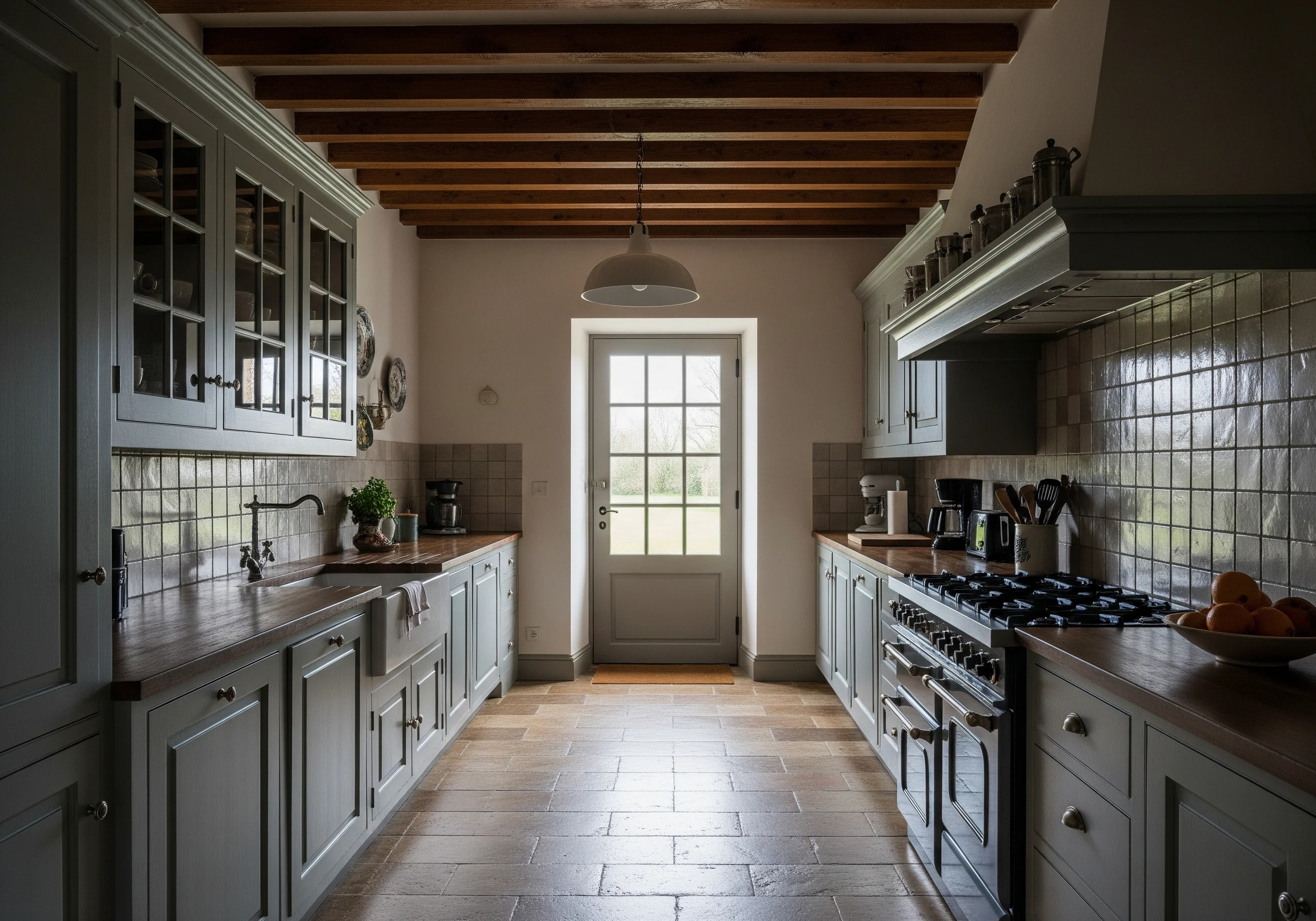
EDITORIAL NEGATIVE SPACE–ENHANCED VERTICAL PROMPT (EN)

A hyper-realistic, ultra-high-definition (8K) vertical-format interior photograph, composed explicitly for a luxury interior magazine where editorial negative space is a primary design element. Professional architectural photography, calm, refined, timeless.

Portrait orientation with generous breathing room. Camera positioned at eye level (~150cm), slightly off-center, wide-angle lens with minimal distortion. Composition intentionally weighted to one side, leaving clean, uncluttered wall areas suitable for headlines, pull quotes, and body text.

Lower foreground: the edge of a dark, time-worn farmhouse worktable (#5A4632) softly cropped at the bottom, occupying no more than the lower 20% of the frame. Table styling is restrained and asymmetrical: stacked Limoges and Sèvres porcelain (#F8F8F6) and a vintage manual coffee grinder (wood #3B2E23, metal #7A6A58), placed to one side, leaving visible empty tabletop surface.

Midground: a tall dark wooden cupboard (#3E2F24) positioned slightly off the central axis, acting as a vertical counterweight rather than the focal center. Glassware and ceramics are visible but subdued, avoiding visual noise. A wooden rosary with cross (#5C4A3A) hangs quietly, subtle and symbolic.

Primary negative space: a large uninterrupted expanse of aged plaster wall in CREME ANCIEN (#F3EFE6) occupies nearly one-third of the frame. Side-lit by natural daylight to reveal soft texture without harsh contrast. This area is deliberately free of objects, designed for editorial typography overlay.

Upper background: a half-open door painted CACHEMIRE (#C6C1B6) with a CREMEUX (#EFE6D8) frame placed toward one vertical edge, not centered. Golden volumetric sunlight (5200K) enters diagonally, forming a gentle gradient rather than a sharp beam. Beyond the door, a soft glimpse of garden green (#4F7F4A) adds color without competing with text space.

Floor of weathered terracotta tiles GRIS CLAIR (#B5B5B0) recedes quietly into shadow, guiding the eye upward. Heavy ceiling beams in deep patinated wood (#4A3A2A) frame the top edge but remain partially cropped, preventing visual heaviness.

Secondary light source: a table lamp with Quimper pottery base (blue #2F6F8F, cream #F2E6D8) and a checkered lampshade in BEIGE ROSE (#D6B6B1), CREVETTE (#E3A39C), and white (#FFFFFF). Lamp glow is soft (2800K), localized, never overpowering the natural light.

A modern stainless steel refrigerator (#C9CACC) is pushed deep into shadow in the background, intentionally de-emphasized. Two small dark wooden stools (#3A2C22) rest quietly along the wall, barely breaking the negative space.

Editorial finish: neutral contrast curve, strict HEX color fidelity, deep focus without clinical sharpness. Subtle vignette that respects text margins. No clutter, no exaggeration, no decorative excess. Designed to feel calm, spacious, and typographically friendly.
投稿者プロフィール
-
小畑彰 1948年11月東京都中野区生まれ、血液型B型。
1. 画家Vincent van Gogh研究者として:
約40年間、画家Vincent van Goghについて、次々と発見される一次情報を精査し、私自身の視点から、Goghの本質について研究を続けている。現在、膨大な一次資料の最終チェックを進めています。
2026年秋頃より3ヵ年計画で順次公開、ペーパーメディアでの各国版出版も予定しています。
2 AIアーティストとして:
AI技術を活用して、独自のデジタルアートを創作するアーティストです。テクノロジーとクリエイティビティの交差点で、新しい表現の可能性を探求しています。『aigenart』は、私の作品やアイデアを世界に発信する場であり、AIがもたらす美しさや楽しさを皆さんと共有したいと考えています。
3. 戦争反対論者として:
20代の頃から日本国憲法第9条(戦争の放棄、戦力の不保持、および国の交戦権の否認)改憲には、強い反対の意思を堅持している。
4. mail**igenart.jp (スパム対策のため、** を @a に入れ替えてください)
最新の投稿
 JSON2026-05-21砂の穴、泥の道、岩の山 — 安部公房、タル・ベーラ、カミュが問う不条理の先に
 JSON2026-05-18雨の夜、フロントガラス越しのモノクローム
 JSON2026-05-13他者(外界)への通路
 JSON2026-05-10見えない視線の恐怖