AI画像生成でモノクロ写真やビンテージな世界観を表現しようとする際、単に「black and white」や「grayscale」といった指示を出すだけでは、どこか現代的で無機質な仕上がりになってしまうことはありませんか?時代遅れのノスタルジーや、夕暮れ時の淡い空気感といった「情緒的な光と影」を制御するには、より厳密な色のコントロールが必要です。
そこで本記事では、白から黒にいたる階調を繊細に描き分けるための**「Black to White 256色 選択ツール」**をご紹介します。
「name」: 「Classic Parisian Café Photo」,
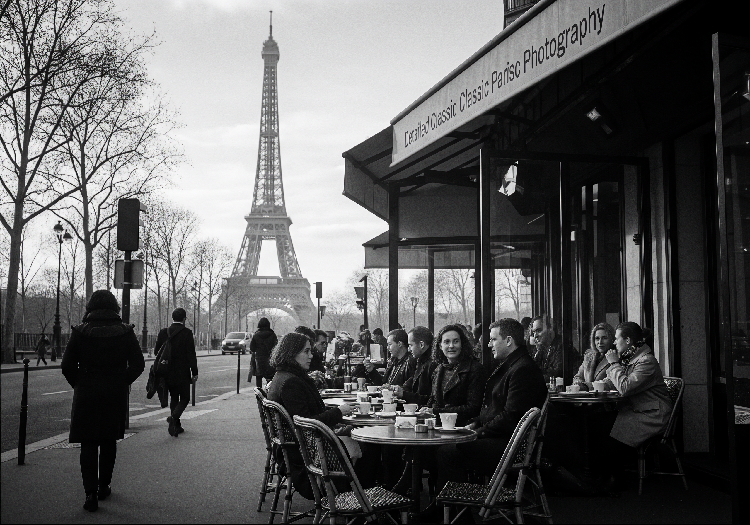
    「description」: "This black-and-white photograph captures the exterior of Café des Fleurs, a Parisian café on a street corner in the 1950s. The Eiffel Tower is visible in the background, and people enjoy coffee on the outdoor terrace. The street captures a quiet moment just before sunset.
To recreate the atmosphere, ambiance, and nostalgic light of that era, do not use a standard grayscale mode. Generate the image with a focus on the specified HEX values."
 },
  "mood": {
    "realismLevel": "Photorealistic",
    "emotionalTone": "Nostalgic, Charming, Elegant"
  },
   "color": {
    "hue": "monochromatic grayscale with faint sepia tint",
    "palette": ["#F7F7F7", "#D3D3D3", "#808080", "#1E1E1E", "#4434343" "#E7E7E7"
    ],
    "contrast": "high contrast with detailed light and shadows, soft transitions",
    "brightness": "medium ambient lighting with soft diffused highlights",
    "saturation": "desaturated with a vintage sepia tone for added warmth"
  },
    ],
    "contrast": "balanced—bright light and muted shadows",
    "brightness": "medium ambient lighting",
    "saturation": "subdued saturation"
  },
  "camera": {
    "zoom": "moderate—balanced subject and background",
    "angle": "neutral front view",
    "perspective": "eye-level view",
    "depthOfField": "medium—subject sharp, background soft"
  },
  "texture": {
    "grain": "light, film-like texture",
    "brushStyle": "none",
    "detailLevel": "high with soft finishing touches",
    "lineQuality": "soft natural edges",
    "surfaceStyle": "photorealistic with vintage grain"
  },
  "lighting": {
    "direction": "diffused overhead daylight",
    "intensity": "high, clear daylight",
    "volumetric": false,
    "shadowStyle": "soft but defined edges",
    "temperature": 5500,
    "highlightStyle": "soft, diffused highlights"
  },
  "rendering": {
    "format": "JPEG",
    "medium": "black and white film photography",
    "animated": false,
    "outputSize": "square"
  },
  "atmosphere": {
    "fog": "none",
    "grain": "gentle vintage-style grain overlay",
    "vignette": "natural subtle vignette",
    "ambientMotion": "static and calm scene"
  },
  "composition": {
    "depth": 3,
    "focus": "place subject in environmental context",
    "framing": "open and cinematic composition",
    "motionFlow":
まとめ
今回は、モノクロームの表現力を劇的に高める「Black to White 256色 選択ツール」の機能と、それを活かしたプロンプトデザインについて解説しました。
1. 画家Vincent van Gogh研究者として:
約40年間、画家Vincent van Goghについて、次々と発見される一次情報を精査し、私自身の視点から、Goghの本質について研究を続けている。現在、膨大な一次資料の最終チェックを進めています。
2026年秋頃より3ヵ年計画で順次公開、ペーパーメディアでの各国版出版も予定しています。
 Prompt2026-09-082026 Best Prompts and Tips(3)
 Prompt2026-09-012026 Best Prompts and Tips(2)
 Bokeh2026-08-26【AI画像生成】美しいボケ味は「レンズ名」で決まる。自然言語で操る光と影、そして幻の針穴カメラ表現
 Flow2026-08-16Google Flowを使いこなす